PHOTOSHARE APP
Concept/Design
A web page that acts like an app
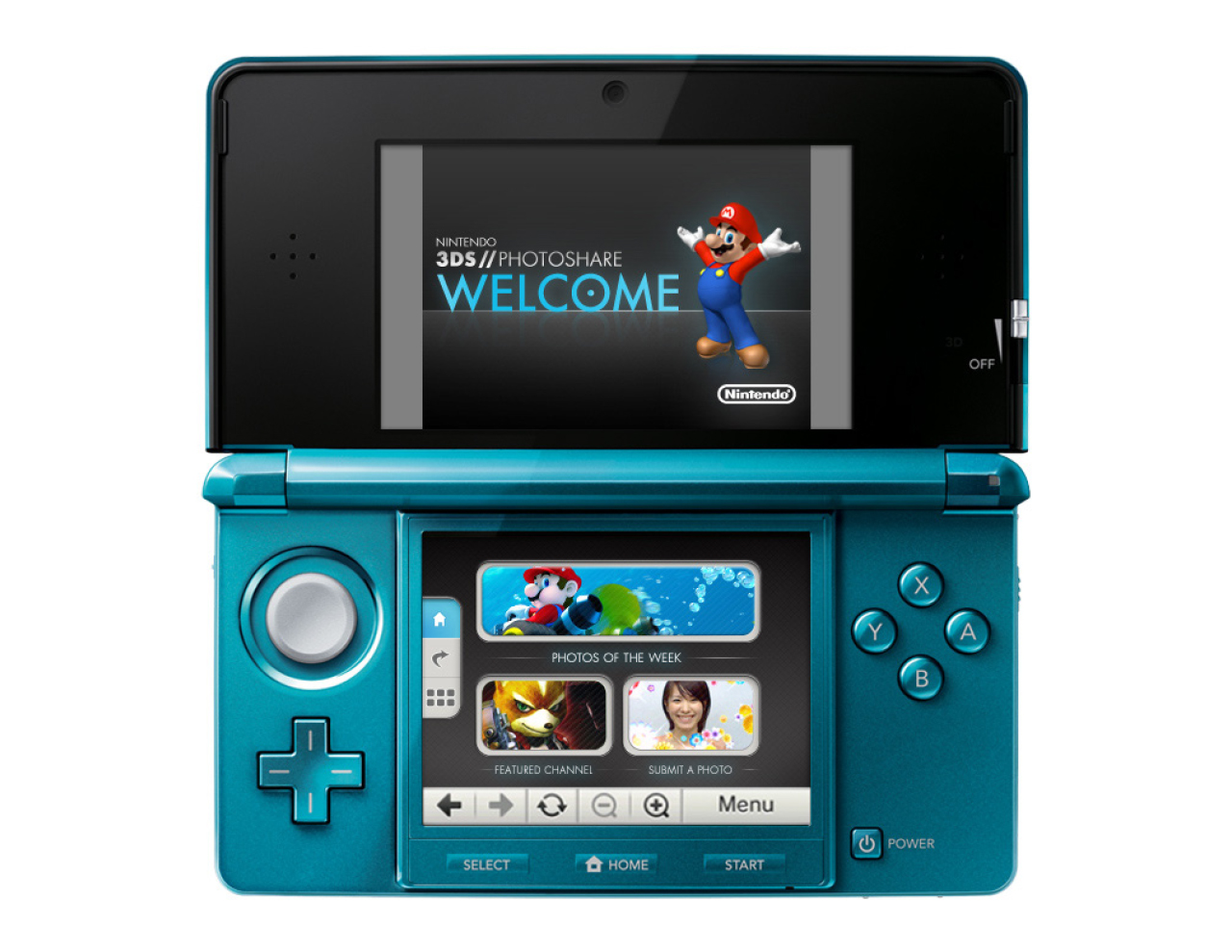
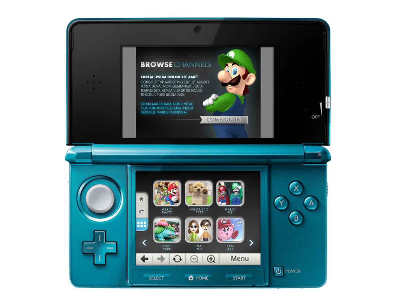
2 looks were created for client approval. A light and airy version based around the current 3DS product pages that would be harmonious while having a character all it's own. The second more daring version going much darker with splashes of luminous blue.
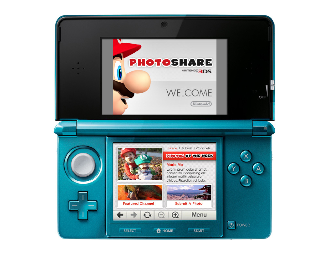

Due to the limits of the 3DS browser, a persistent navigation system was employed in both designs to allow for greater ease of use. In the darker version it takes the form of a set of recessed buttons running down the lefthand side of the screen. For the lighter design it became a simple text based structure that sat in the upper right quadrant and complimented the starker appearance.
App, Digital, UX