Concept/Design


The ACE brand is unique. Full of character it stands apart from the rest of the hospitality industry. Seattle, New York, Portland and Palm Spings, every locale is distinct, yet speaks using a common visual language. Strategy dictated that all designs be as specific to the area and as interesting as the hotels they represent.
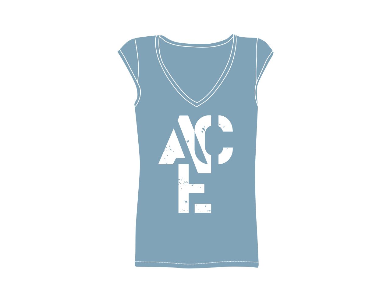
Each poster and T-shirt has a separate thematic aesthetic based on the locale. In the spirit of the the ACE brand though, each design shares a similar set of fonts and textures. The New York poster for instance was designed using a bauhaus styling, but paired with an elegant rough quality. The Portland T-shirt on the otherhand is letterpress styled. A playful use of typography, but with sharp angular forms that feel utilitarian, almost militaristic.